Packaging Illustration for El Mesías
When El Mesías reached out, they were looking to give their brand a bit of a glow-up. They're a well-known sweets and cookies factory, especially famous for their mantecados (if you know, you know), sold all over Spain. The factory’s based in a small village in the south called Estepa, and they’ve been around for over 60 years. Their designs? Not quite that old, but some definitely felt like they’d been sitting on the shelf for a decade or two.
They wanted to bring some freshness to their packaging, more color, more personality, and a bit of modern charm. At first, they weren’t entirely sure what they were after, but once they shared a few packaging examples they loved from competitors, a clear trend popped up: all of them featured some form of illustration.
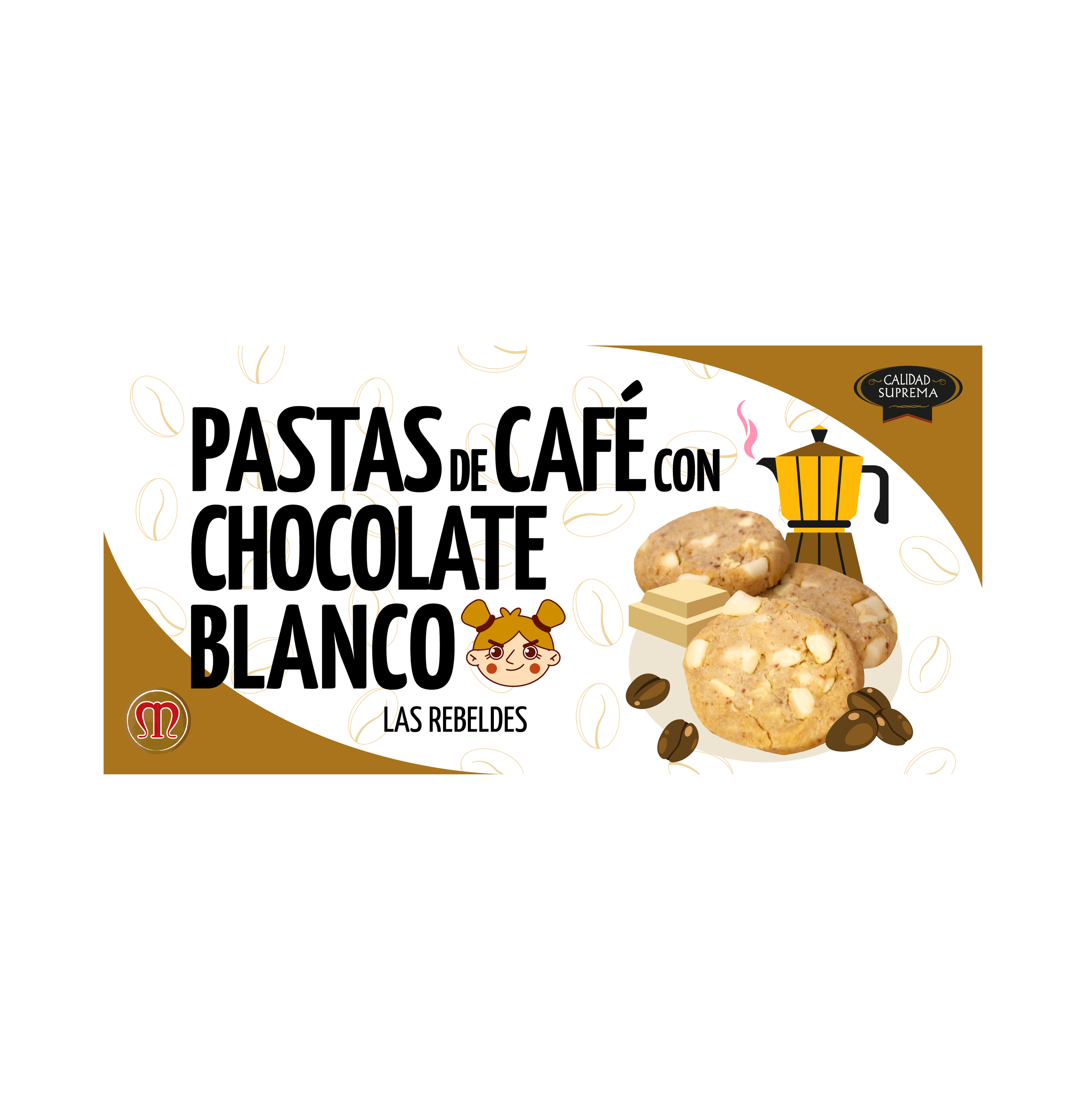
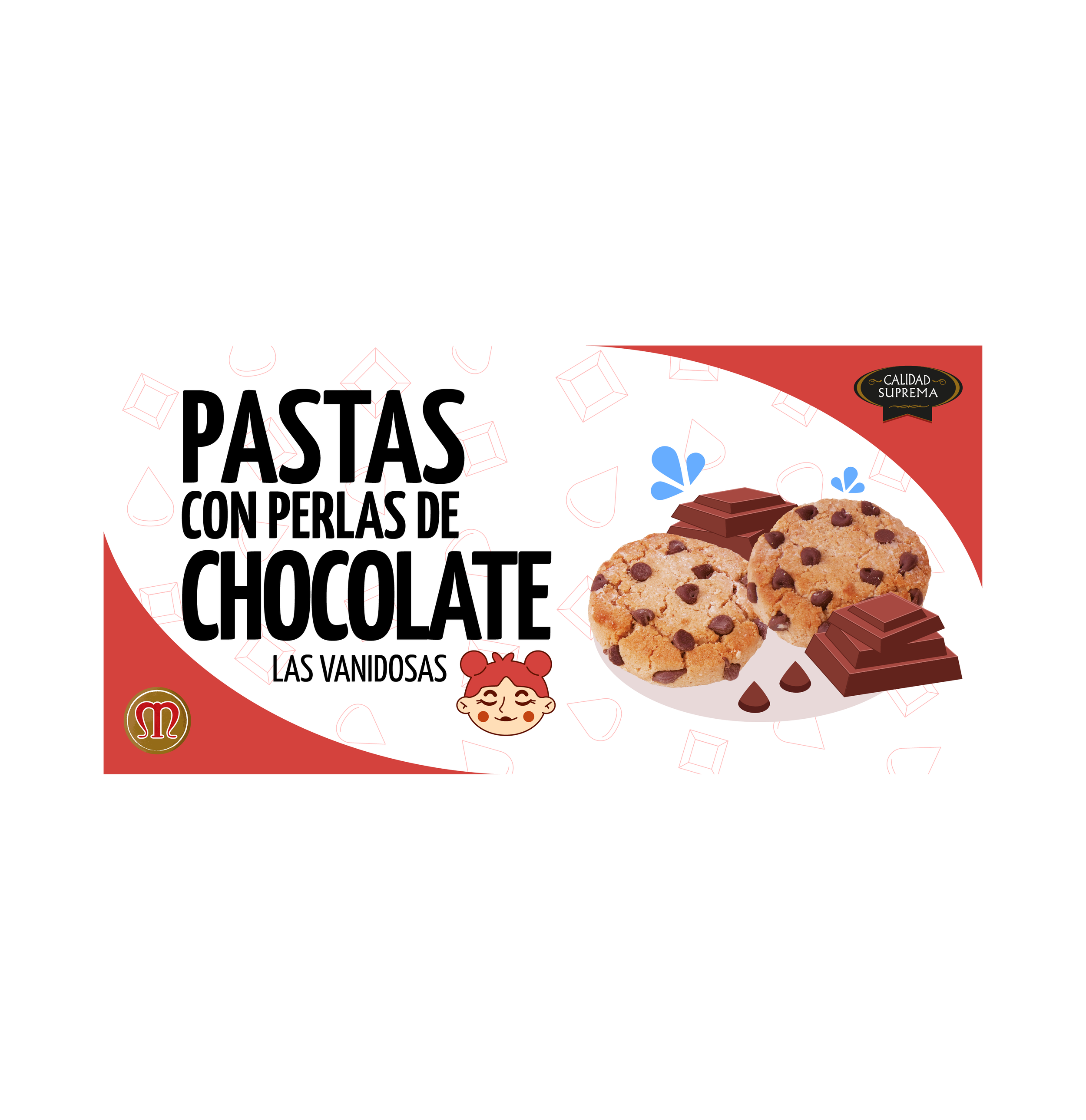
Every cookie and chocolate got its own name, The Coquettish Ones, The Rebels, The Delicate Ones, The Unpredictables, and an illustrated face to match. The goal was to make them fun, memorable, and just a little cheeky. Basically, to give each treat its own little personality and make people smile before they even took a bite.
In the end, they were absolutely thrilled with the designs, and seeing their brand come to life in such a playful, bold way made the whole project even sweeter.